
There was a time in the 1980s when Papyrus was all the rage when it came to typography, not to mention its resurgence in 2009 thanks to the font choice for James Cameron’s Avatar. Although hard to believe now, even Comic Sans was once viewed as trendy, new, and fresh. But what about today’s font trends?
D&A summer graphic design intern, Elli (they/them), dedicated their capstone project to researching 2025 trends in typography: why do they matter, how do they happen, and what’s trending now.
why do trends matter?
Trends reflect current aspects of society and, therefore, if you utilize them, then congrats, you are keeping up with the times. Trends help capture the audience’s attention—after all, they’re trends for a reason—but watch out when they go from trending to stale. Oftentimes, trends act as a launchpad for new creative direction, so they evolve and morph into something completely different.
Why Do Trends Happen?
Trends allow us to see what is and isn’t working in the general public. They’re not just based on the opinions of seasoned designers and industry experts; they’re based on everyone’s opinion—social media comments, local businesses, and you! Trends happen because humans will always want to uplift whatever creates the most engagement, economic growth, and relevance.
How Trends Gain Popularity
- Visual Impact and Emotion: Capturing the audience’s attention, conveying a certain mood, or bringing in personality and uniqueness.
- Cultural and Societal Influence: Relating back to media and pop culture, or simply mirroring what is being popularized in other creative industries like fashion or architecture.
- Technological Advancements: Utilizing new technology like AI, variable fonts, or creating something with a new aspect of accessibility.
- Adapting and Adopting: Taking inspiration from publications with high viewership. This can range from articles and case studies to simple social media posts.
Trending now
Y2K
Playing into nostalgia with a futuristic vibe
- Example: They That Do
- Combining clean sans-serif and pixelated fonts to evoke Webl nostalgia while still keeping it fresh and contemporary.


Nouveau Futurism
More fluid and experimental. A counterpoint to Y2K
- Example: Superfried
- An experimental typeface collaboration called Marbles.
Ephemera-Inspired
Challenging vintage aesthetics in a timeless way
- Ex: Globe Press at MICA
- Globe promoted the people’s entertainment, including vaudeville, burlesque, movies, circus and carnival acts, and found its groove in the 1960s with posters for top R&B and rock acts like Mavis Staples, Otis Redding, Marvin Gaye, and the Beach Boys. After being acquired by MICA, Globe continues to produce ephemera posters for various clients, organizations, and businesses, locally in Baltimore and beyond.

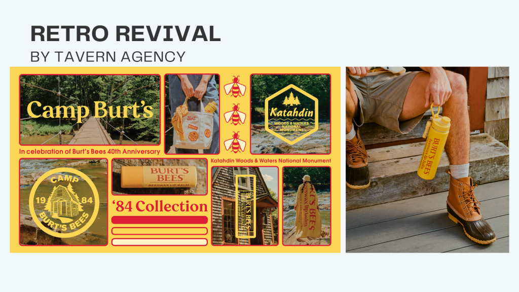
Retro Revival
Refining and modernizing a specific brand’s historical design elements
- Ex: Tavern Agency
- Brooklyn-based agency Tavern has become masters of this balancing act (brand revivals not replicas) with their recent rebrand for Burt’s Bees’ 40th anniversary campaign for The Camp Burt’s ’84 merch collection. This allows brands to celebrate their legacy while staying relevant, a seamless bridge between tradition and modernity.
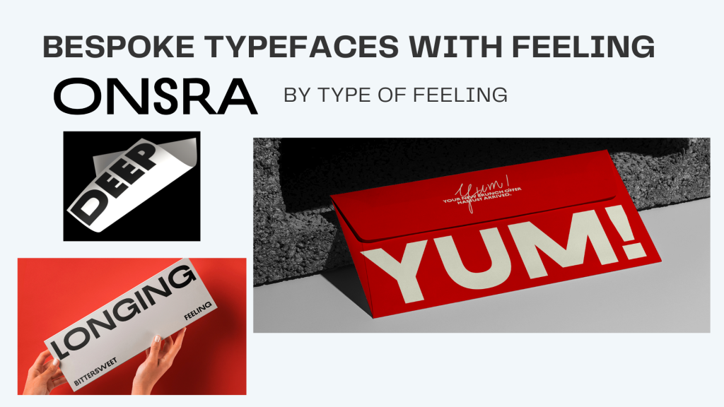
Bespoke Typefaces with Feeling
Typefaces that serve a functional purpose, and also evoke an emotional response
- Ex: Onsra
- Onsra is the bittersweet feeling of longing for someone or something that one knows cannot be returned. Onsra’s design captures the idea that these emotions expand with memory and contract with reality, represented by the font’s dynamic width.
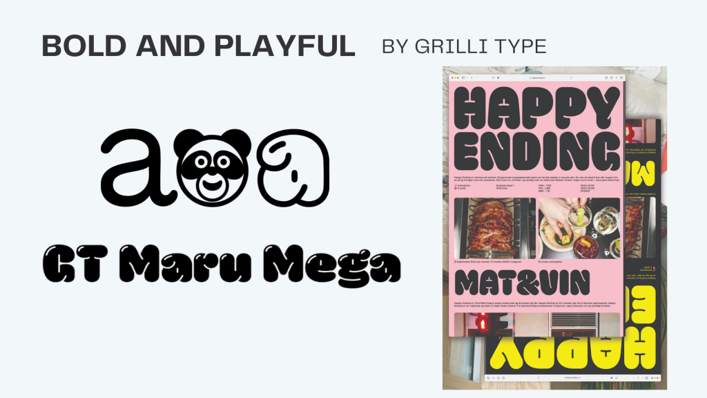
Bold and Playful
Moving away from the minimalist aesthetics of the past
- Ex: Grilli Type
- GT Maru is an ode to rounded English characters found on signage across Japan. The typeface is the result of this design exploration into roundness — or maru — in the Latin alphabet. It combines the warmth and flow of sign painting with the mechanical quality of engraved letters.
Variable Typefaces
Flexibility for designers, multiple styles and weights to coexist within a single file
- Ex: Pangram Pangram Foundry
- PP Fragment is born from vintage lettering and signs, bridging 19th-century letterforms and contemporary typography. It comes in 4 preset cuts, Sans, Serif, Glare, and Text, each with unique personalities and quirks. Each weight counts 581 glyphs with plenty of alternate symbols to achieve the desired result for your next design.


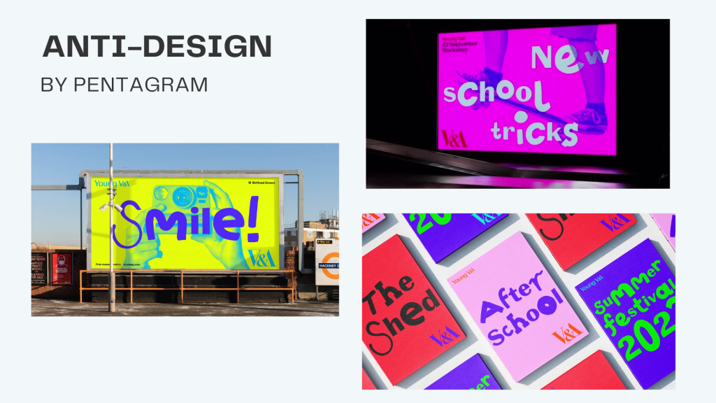
Anti-Design
Embracing a raw and intentionally lo-fi look
- Ex: Pentagram
- Building on the V&A’s mission to champion creativity, Pentagram’s task was to reimagine the brand of the V&A Museum in Hackney and express its unique voice within the wider brand family. Pentagram hacked the museum’s custom Spiller typeface, mixing its Extrabold weight with a selection of handmade characters and creating a playful, diverse, and participatory brand look. The hacked typeface has a cheeky, lively, and free-flowing voice.
Kinetic Typography
Leverages animation to bring letters and words to life
- Ex: Tina Touli Design
- A series of kinetic typography artworks (Shifting Symphonies) with the theme of transition has been created, exploring different aspects of change and transformation.
- From the balance and duality of the Yin Yang, to the explosive power of the Big Bang, to the progressive nature of Come and Go, to the ups and downs of Up/Down We Go, and the all-encompassing nature of Here, There, Everywhere, these pieces showcase how transition is an essential process of change that affects everything and everyone.
Unconventional and Illustrative
More expressive typographic treatments and fewer clean lines and minimalist fonts
- Ex: Omse
- Black Bee Honey aims to free the bee. With a wild set of characters that represent Black Bee Honey’s key values and celebrate the landscapes and seasons in which each honey is produced.
D&A Knows Our Stuff
With over three decades in the marketing, advertising, and public relations business, we’ve been around to see the rise and fall of many typefaces—so we know just how to create timeless logo lockups, fresh publication headers, and exciting brand guidelines!