When it comes to graphic design, every project’s purpose—whether it’s a logo, website, or digital ad—is to appeal to and attract your target audience and then present them with your key message and call to action (CTA). To ensure you’re keeping good form when designing marketing communications, we’ve created a basic designer’s training guide. Let’s get started!
Training Tip #1: Keep It Structured
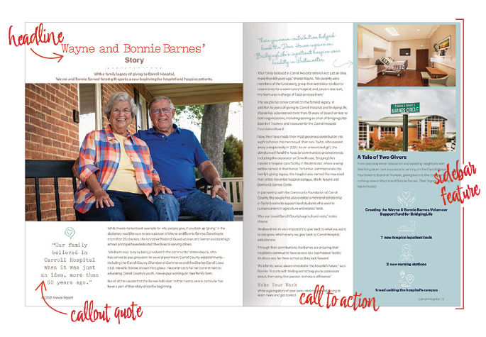
Visual hierarchy is a key part of any graphic design project! You want to rank the elements of your design—like the headline, campaign visual, callout, body copy, and CTA—based on order of importance so there’s structure to your design. Once there’s an obvious structure, a viewer will be able to interpret the main information on the creative piece, so their eyes can naturally and easily move through it.
Pictured: 2021 Annual Review, Carroll Hospital
Training Tip #2: Don’t Be Afraid of Movement
A designer uses lines, shapes, and forms to create movement or motion within a design. These specific elements also help emphasize the visual hierarchy while guiding the viewer’s eyes across the page or ad.
Pro Tip: Use a design grid to help structure your layout and aid the viewer’s eye movement.
Training Tip #3: Create Contrast for a Dynamic Design
Contrast makes it clear what element of your design you want the viewer to see first or focus on the most. Usually, contrast is used to spotlight the most important information on your layout. An easy way to create contrast is by making one element of your design larger than the others to draw attention to it.
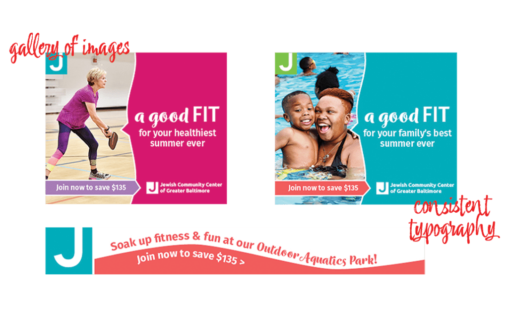
Unity and cohesiveness are essential for good design form. Every element you choose to use in your design should be intentional and consistent. Following this practice will make campaign concepting and designing ads of all different sizes a breeze because you’ll already know the significance of harmony when it comes to colors, fonts, images, and more!
Pictured: 2021-22 Membership Campaign, Jewish Community Center of Greater Baltimore
Training Tip #5: Find Your Balance
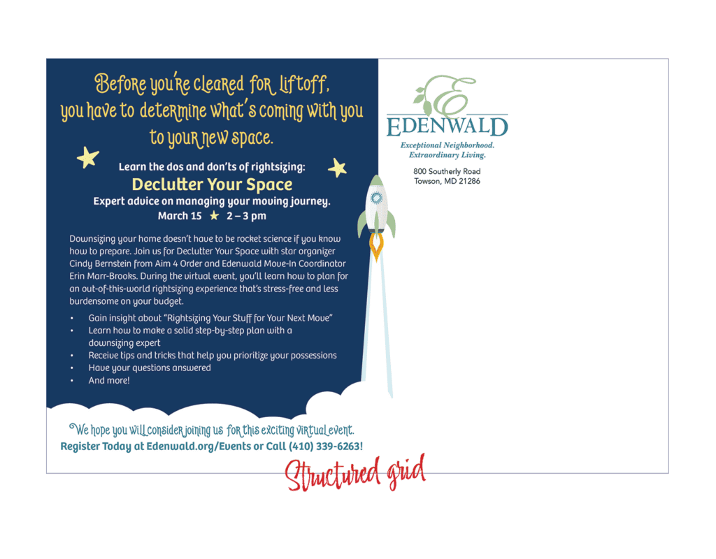
How do you ensure your design is visually appealing to viewers? With the help of balance! When you keep your visual elements and space equal in weight on both sides of your layout, you’re essentially creating stability—and an impactful design. Often, if a design is unintentionally messy, your message will be lost—no matter how well it is written.
Pictured: Event Mailer, Edenwald Senior Living
Help! My Designs Are Still Falling Flat.
Don’t be afraid to train with the experts. Contact our team for assistance with your next big design project—we’d be happy to show you the ropes when it comes to excellent design form!
Logo creation | Web design | Publication design | Brochures and sales materials | And more!